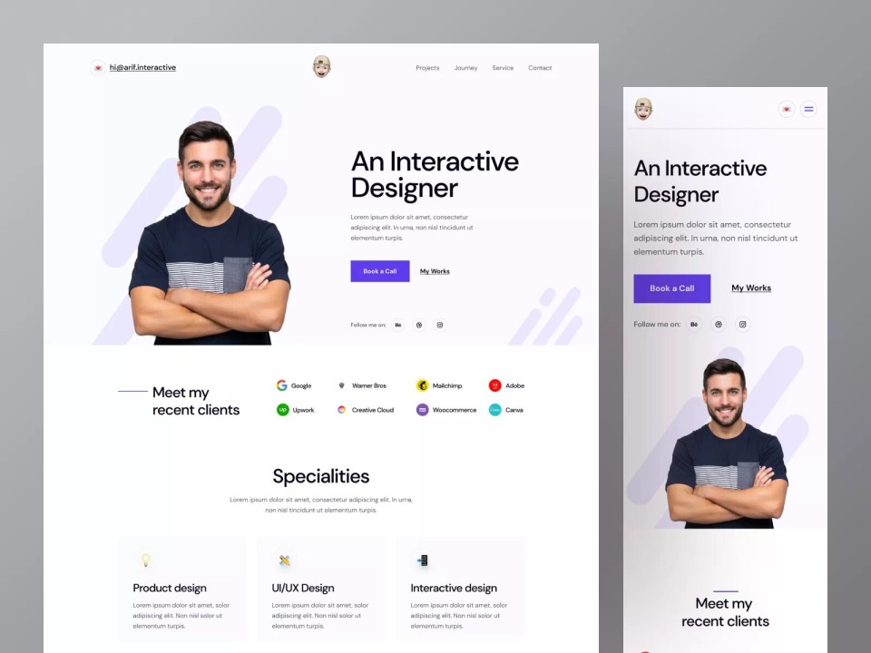
10 Eye-Catching Design Elements for a Stunning Portfolio Website
Creating a stunning portfolio website requires attention to numerous design elements that not only enhance aesthetics but also improve user experience. Here are 10 eye-catching design elements to consider when building your portfolio:
- Minimalistic Layout: A clean and simple layout allows your work to shine without distractions.
- High-Quality Images: Crisp, high-resolution images can make a significant difference in how your work is perceived.
- Bold Typography: Unique and legible fonts can reflect your personality and draw attention.
- Dynamic Color Schemes: Use colors that resonate with your brand while ensuring readability and visual appeal.
- Interactive Elements: Adding hover effects and animations makes the browsing experience more engaging.
Continuing with our list, the following design elements are essential for making your portfolio site memorable:
- Consistent Branding: Ensure that your logo, colors, and overall style match your professional brand.
- Mobile Responsiveness: A portfolio that looks good on all screen sizes is vital in today's mobile-first world.
- Testimonials Section: Include quotes from previous clients or collaborators to build credibility.
- Call-to-Action Buttons: Clear CTAs can guide visitors towards contacting you or viewing your projects.
- Social Media Integration: Allow easy sharing of your work across various platforms to expand your reach.
How to Choose the Perfect Color Scheme for Your Portfolio
Choosing the perfect color scheme for your portfolio is essential for making a strong visual impact on your visitors. Start by considering the overall mood and message you want to convey. For instance, if your portfolio showcases creative work like photography or graphic design, vibrant and contrasting colors can draw attention to your projects. On the other hand, a more muted palette may work better for professional fields such as finance or law, where a sense of stability and trust is paramount. Use tools like color wheel generators to explore complementary and analogous color combinations, helping to create a cohesive look throughout your portfolio.
Once you have a basic idea of your desired aesthetic, it's important to test how your chosen colors interact with each other. Create mock-ups of your portfolio's layout and apply your selected palette to see how the colors work in practice. Ensure that your color scheme not only enhances the visual appeal but also maintains readability across various devices. Consider the following tips when finalizing your choices:
- Limit your palette to three to five main colors for consistency.
- Utilize a contrasting color for actionable items, such as buttons or links.
- Keep accessibility in mind to accommodate all viewers.
Are You Making These Common Mistakes on Your Portfolio Website?
When it comes to showcasing your work, many professionals unknowingly make crucial errors on their portfolio websites. One of the most common mistakes is neglecting mobile optimization. With a significant portion of web traffic coming from mobile devices, failing to ensure your site is mobile-friendly can lead to a loss of potential clients. Additionally, poor navigation can confuse visitors and discourage them from exploring your portfolio further, so it's vital to create a seamless user experience.
Another pitfall to avoid is using outdated or low-quality images. Your portfolio is a reflection of your skills and style, and high-quality visuals are essential in making a lasting impression. It's also important to keep your content updated; showcasing your most recent work demonstrates growth and keeps your audience engaged. Regularly revisiting your portfolio to refine your projects and remove any stale content can enhance your professional image and attract more opportunities.